High quality affordable housing
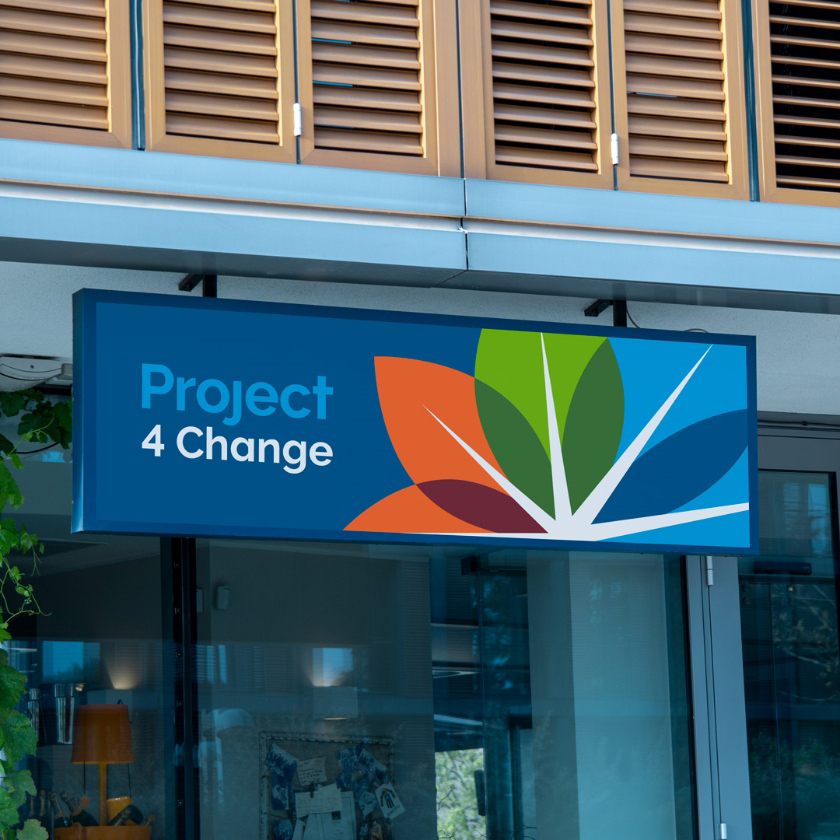
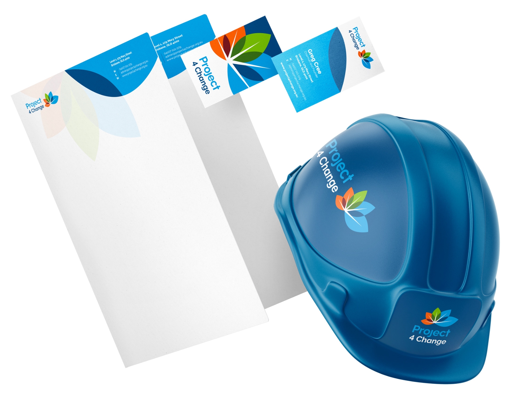
Introducing Project 4 Change
- Rebranding
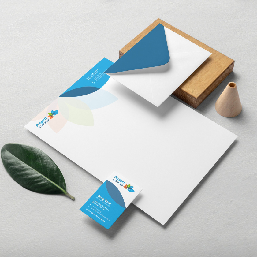
- Brand Identity System
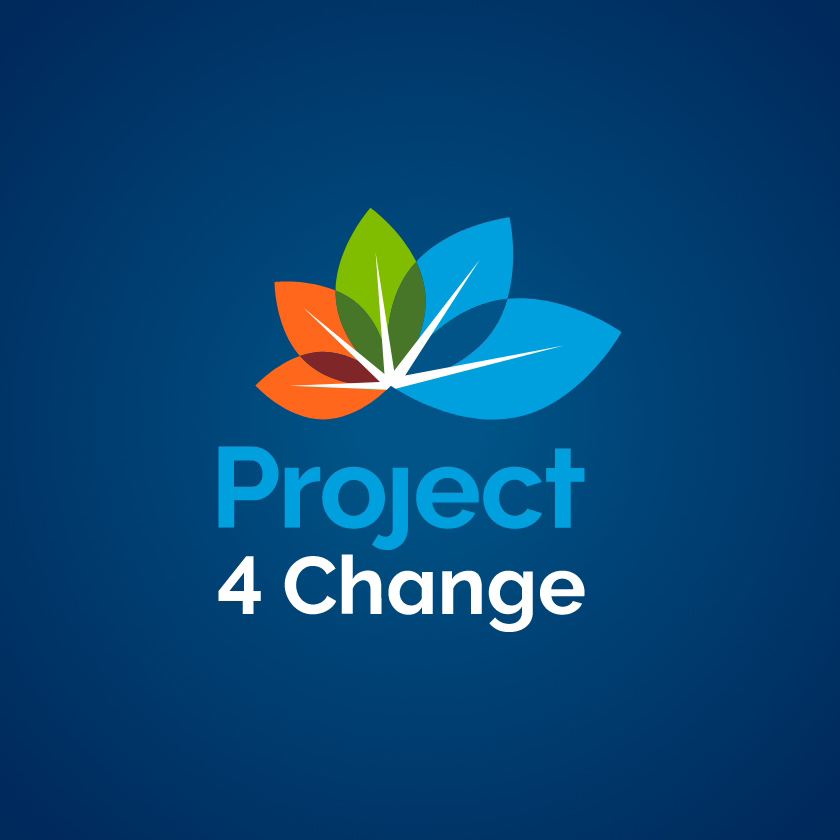
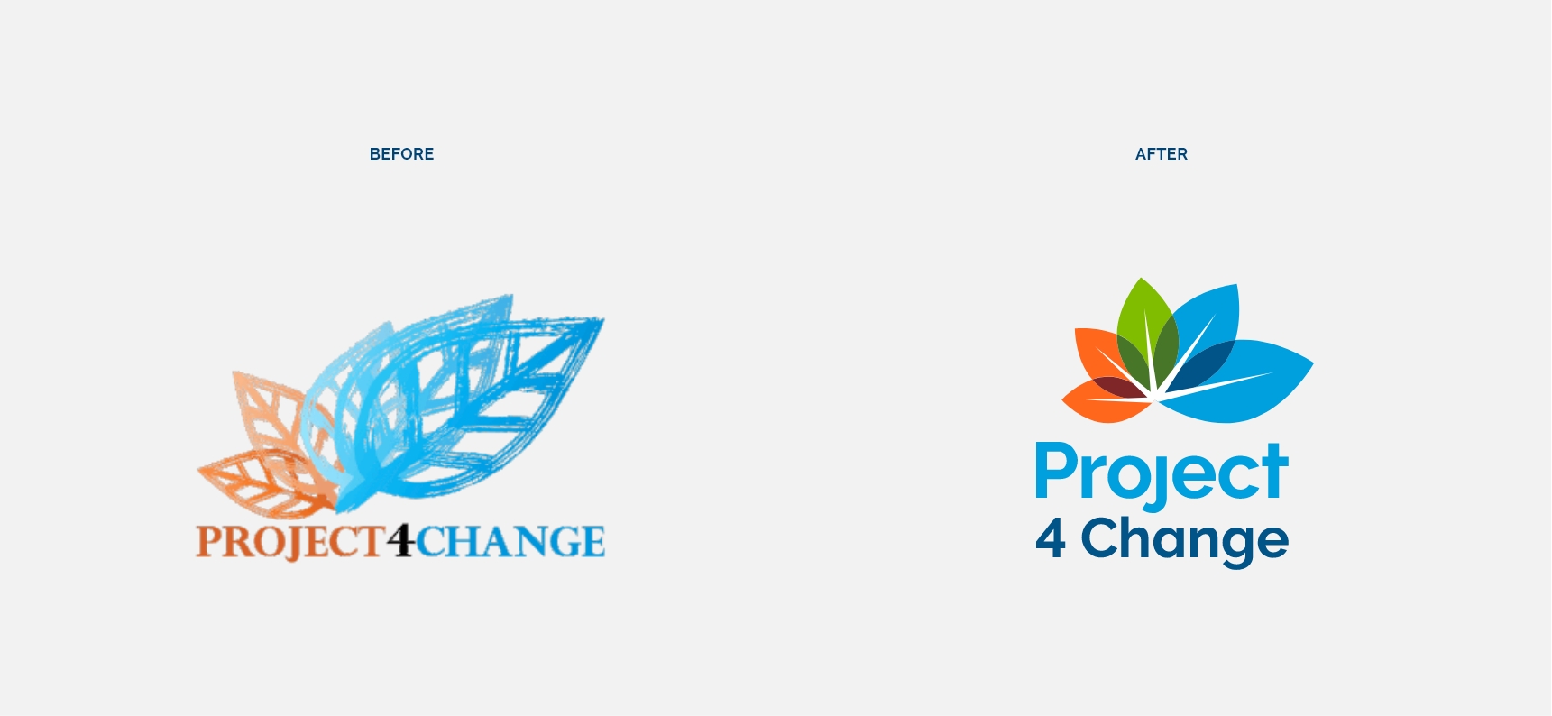
The redesign for the Property 4 Change (P4C) brand identity was guided by the characteristics of its predecessor. Consideration of the original concept was applied to the icon, representing the revival of an entity and nurturing it to realise its potential, displaying growth and a new sustainable life. To support this, as a Brisbane graphic design agency, we revised the original colours to develop a unifying colour palette for which P4C subsidiaries, like Coffee 4 Change, would be based on.
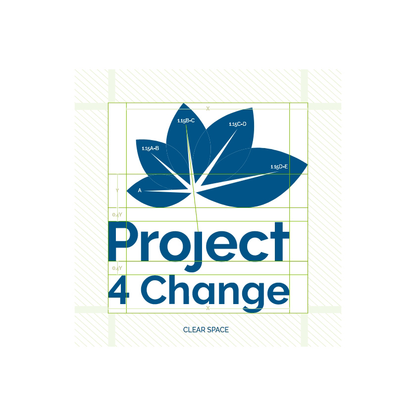
The structure of the design is based on minimalistic geometric symmetry, which establishes an aesthetically pleasing visual identity. The design also lends its visual foundation to its subsidiaries, allowing the brand to create complementary sub-brands that tie in to the parent company.