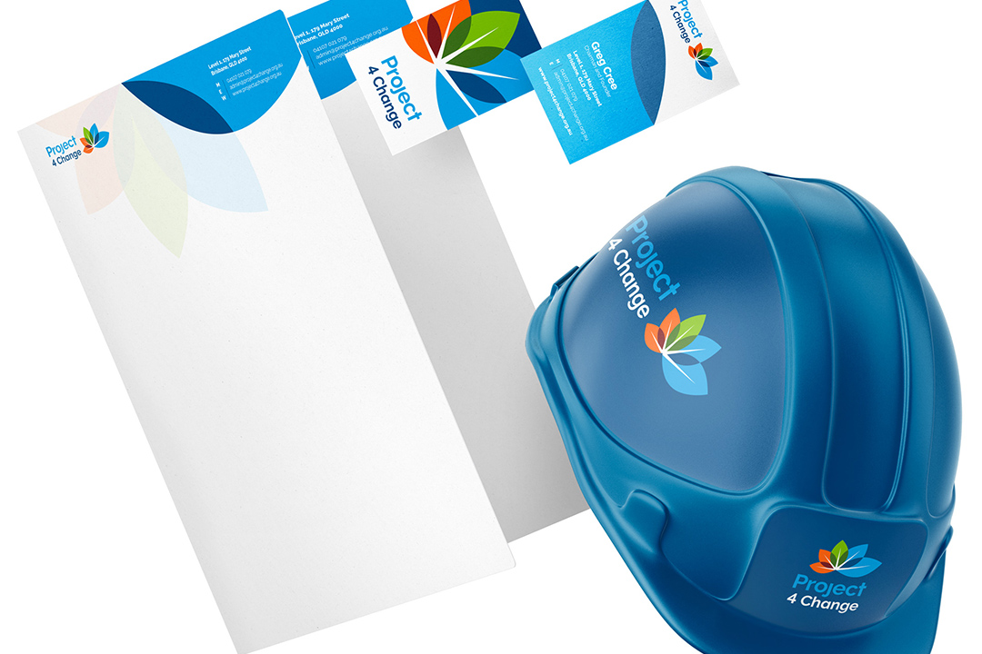
Responsibility. Loyalty. Coffee.
Introducing Coffee 4 Change
- Visual Branding
- UI/UX Strategy
- App Design
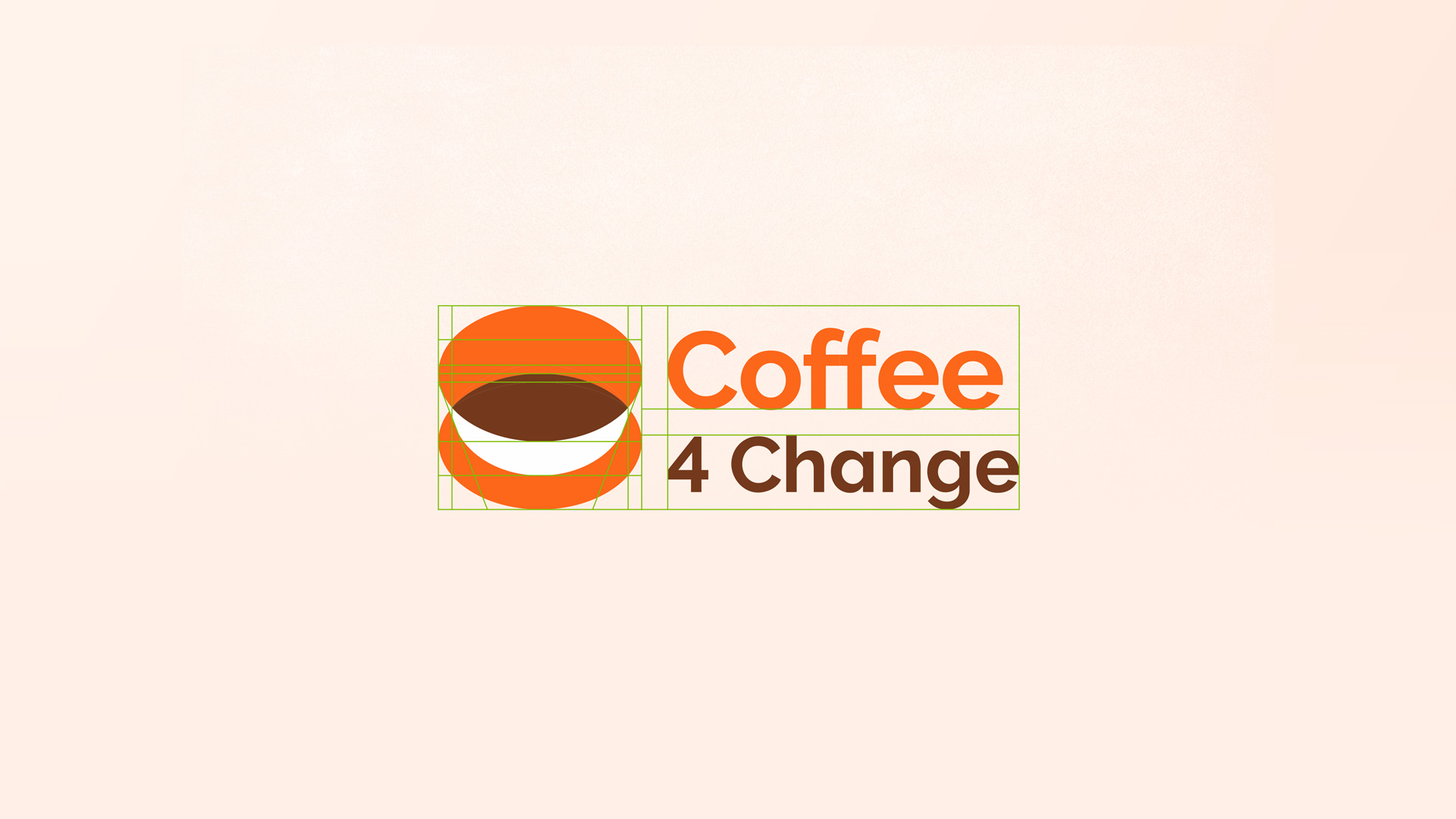
In keeping with the parent brand identity, Project 4 Change, Coffee 4 Change (C4C) was designed with its own meaningful elements. The C4C icon is grounded in community involvement and collaboration, which is historically centred around the fire-pit. The modern version of this concept is the cafe, bringing people & ideas together for a common good, so the icon was designed to incorporate these 3 core elements.

Approach Meaningful Mission
The colour was specifically selected to appeal to the those who appreciate the joy of a journey, human connections, and the taste of a well made cup. The orange is symbolic of energy and the start of a journey, the coffee brown is symbolic of the core ingredient that gives the brand life, and the accent green honours the earth and those that produce the beans that we so enjoy.
When all of these elements are paired with the elegant simplicity of the supporting brand system, we achieve memorable marketability through these identifiable visuals.

Outcome Building a community
The pillars behind the brand identity and strategy is targeted at generating interest and building a community of like-minded individuals in support of the venture, with plans for expansion into other industries.
Results Phase 2 Funding
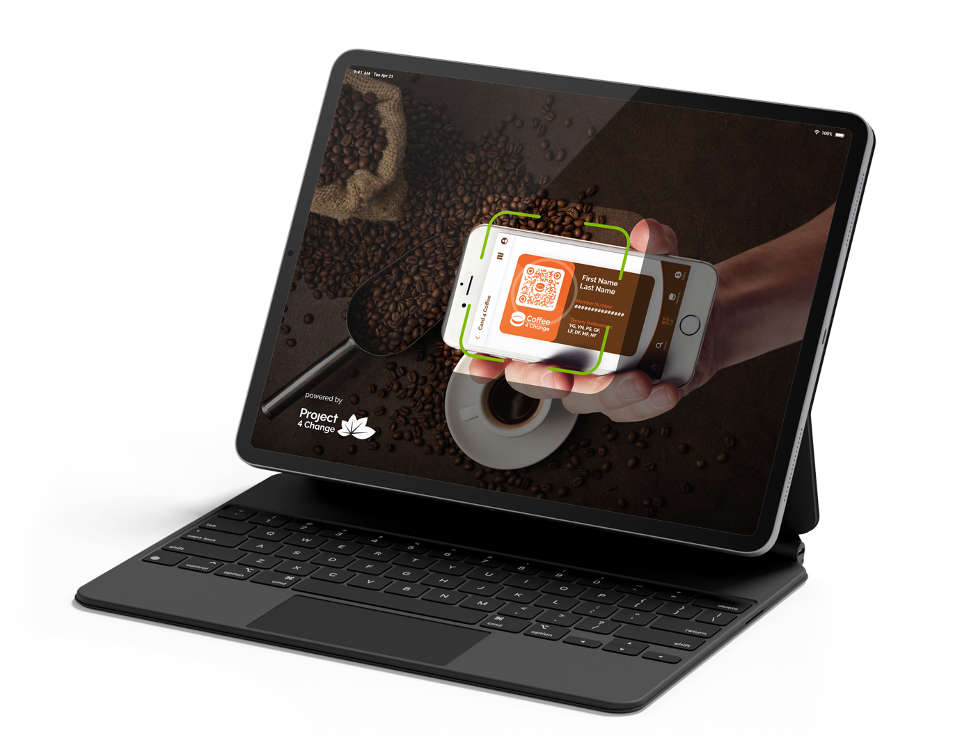
By presentating the completed designs for the app and primary visuals, C4C was also able to gather the support needed to continue on to the development and eventual release of the application.
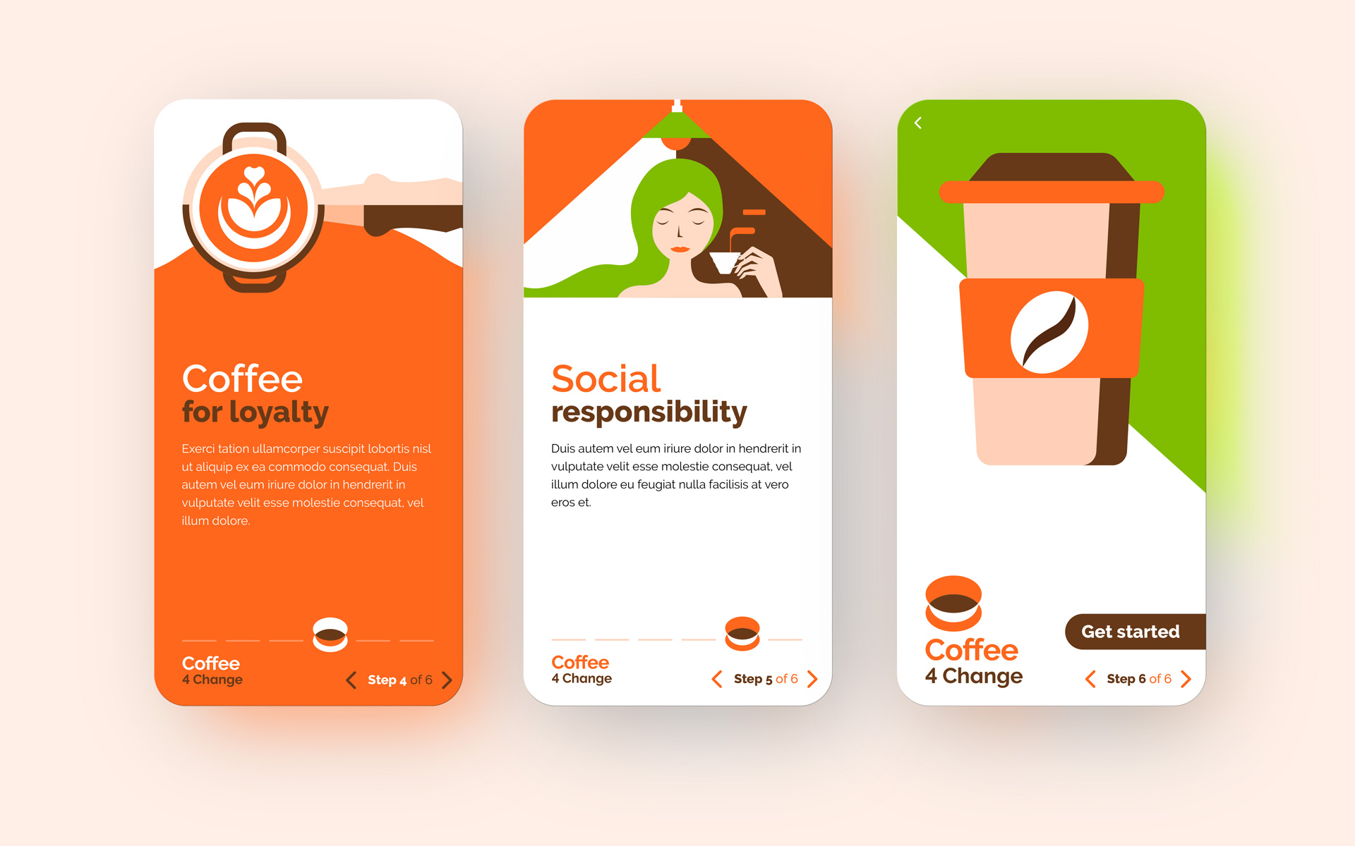
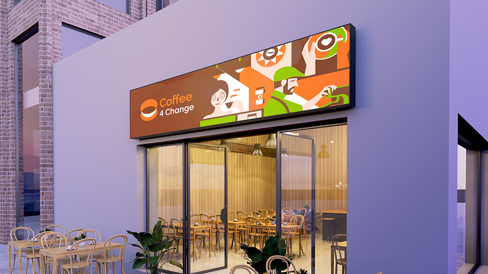
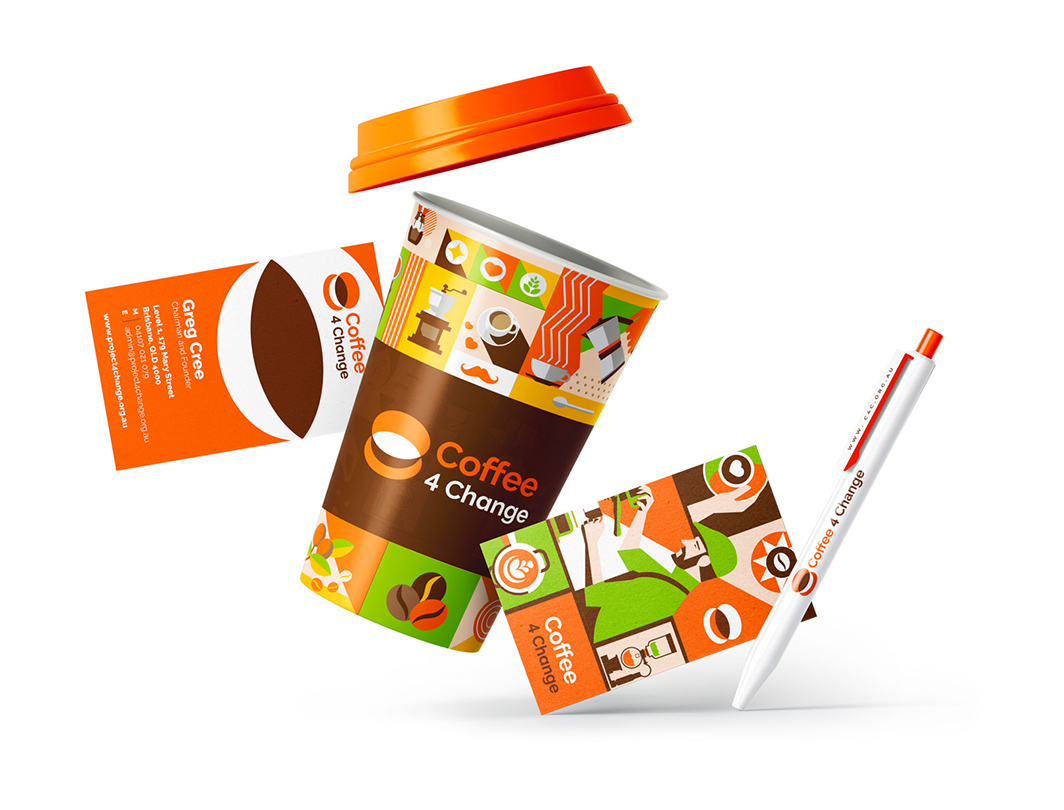
Conceptual mockups used to showcase the potential implementation of the brand identity’s illustrative style across traditional and digital mediums.
