Premium Real Estate Agency
Introducing Goldstone Property
- Branding
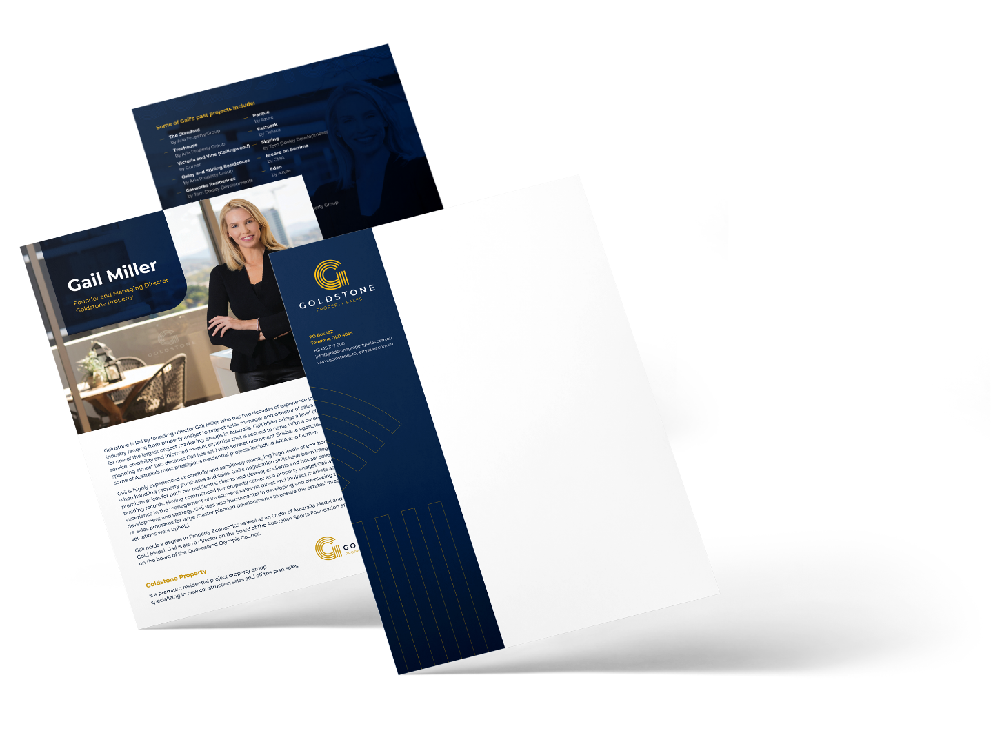
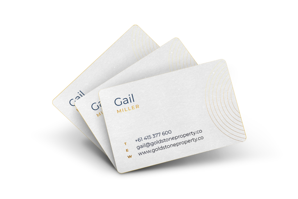
- Stationery and Branded Collateral
- Website Design and Hosting
- Agency Signage
From our verbal branding exercise, we established the core brand concept of “Lifestyle Realisation”, setting the industry standard for managing clients’ societal and/or commercial goals until they become a reality.
Approach Strategic Milestones
From our verbal branding exercise, we established the core brand concept of “Lifestyle Realisation”, setting the industry standard for managing clients’ societal and/or commercial goals until they become a reality.
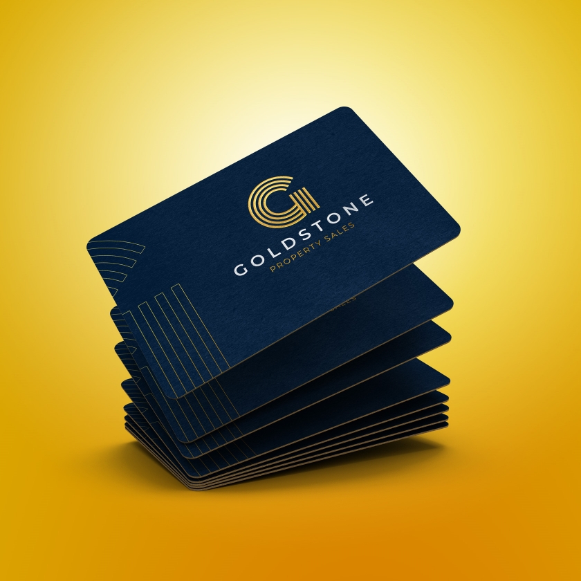
Leading the direction for the visual branding, this concept instructed our typographic approach based on targeted market research and analysis. The brand symbol ‘G’ was developed using the typeface ‘Monoton’, inspired by the metaphoric ‘ripple effect’ of strategic decision-making and the stages involved in making dreams a reality.

Outcome Real estate with a golden touch
Gail and her team saw almost immediate results upon announcing her agency to the public. Supported by her newly developed branding, she was able to leverage her network of developers and buyer/seller databases to launch with resounding success.
Results 6 Properties Sold (+$500,000 each)
Goldstone has sold more than 6 properties in just a couple of months after their launch, with the work we produced playing a critical role in their start-up success.
Results 690 average monthly visits
Establishing a digital presence helped create wider exposure in order for Goldstone Properties to reach a digital audience that were looking to start their home-owning journey.

Feedback Goldstone Property“
From the very beginning, Vesanique was extremely accommodating, paying particular attention to detail and provided every option to achieve the desired result within my budget. They not only made sure I was provided with everything I needed to get my company off to a successful start but developed a brand that can grow with our ever-changing needs.